Wednesday 7 November 2012

Editorial 2


The whole publication follows a simple colour scheme - red, black & stock (excluding pictures).  The information is displayed clearly, with bold text and complementing white space.  There are spreads designed to break the content up, such as the picture and quote, to allow the content to breathe and to keep the reader interested.

---


This is the prospectus for Leeds College of Art 2010-11.  Simple devices such as colour coding Higher and Further education for separation and the use of photography help to freshen the page up and prevent it from being a dull, type driven, informative piece of design.  The photography also helps to back up the message the text is putting across.


---


This is a catalogue for the eyewear company 'dunhill'.  The front and back of the publication is very clean, is printed in a high quality and looks incredibly professional.  It's amazing that a publication can communicate an idea of wealth through it's design - it looks to be aimed at a demographic that can afford designer items, such as wealthy business men.

Again, the whole editorial work is broken down with carefully considered photographs, to give the whole booklet life and to maintain interest.  It also helps to solidify this idea of wealth.

---

Friday 26 October 2012

Experimental Stock Considerations

In my 'Emotion & Type' brief, I will be exploring different stocks & printing methods.  Rather than using stock that I am familiar with, I want to push the boat out this time, and identify stocks that can give my work extra depth and a completely different visual feel to regular paper.


The designer here has taken advantage of existing prints, in this case a newspaper, to create a set of business cards with his identity.  As long as the design overwhelms the current printed work, it could act as a device for intensifying meaning - for example using an article that backs up the quote.  The worst thing that could happen is the two prints clashing, creating a messy outcome that stands for nothing.

---


T-shirts are good printing material, as it adds portability to the design and is more encouraging to buy as a piece of design.  Everybody needs t-shirts to function in society, whereas posters and other paper-based printed material aren't a necessity.  Designs will get more exposure, and will allow a person to openly display a message if they see fit.

---


Giving Type Added Meaning


These posters use devices to enhance the message typographically.  Enlarging key elements of the quotes, twisting a message to give it the opposite meaning and blurring the message to communicate movement are all methods of enhancing the typography in a visual way - without using illustration.

The last example looks as though it could have a 3D effect with the right equipment.  The statement is bold, and to stand off the page would give the design an extra level that would back up the original quote.

---


Another way to give typography an extra layer of meaning is by warping the text into a shape.  Type as image would stay in my brief criteria by not using any illustration.  A way I could respond to this is by warping a courageous statement into a shield, or a fearful quote into a ghost, for example.

---


Distorting the type is an interesting way to give a typographic poster added meaning, as it gives it a visual quality without resorting to illustration.  All of these communicate distress in some way, in my opinion, and the last example in particular is completely readable, although the message looks to be swiped at and damaged.

---


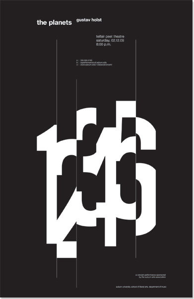
This poster, to me, conveys a sense of haste, cutting the numerals short before immediately moving onto the next one.  The numbers are still understandable, but I'm unsure the same technique would work on letterforms - this example is in numerical order so any that are unclear would be identified by the sequence.  But again, something that I can experiment with.

---


It's interesting to think about the line between illustration & typography.  The droplets are attached to the letterform, but separately, surely it should count as a form of illustration.  I think the distortion of a letterform falls under type as image, so it is still a form of typography.

The letterform could be a response to grief, the extensions representing teardrops.  On the other hand, it could also link to heat - the letterform appears to be melting down the page.  I've got to be careful of misinterpretations, as I have just linked the example to two different meanings.

---

Thursday 18 October 2012

Emotion Within Design

As it is the theme for my 'Emotion & Type' typographic poster brief, I thought I would investigate emotion within graphic design on a broad spectrum, to discover how the designers communicated a certain idea or mood to their audience - through creative techniques and placement.

---


There are so many emotions linked with the tragedy that was 9/11, mainly Fear, Hysteria & Grief.  A lot to deal with, but I think the designer has done a good job of portraying the right emotion at the right time, through typography, layout, info-graphics and photography.

"It was impossible to outrun" to me, is a statement of complete despair, complete hopelessness.  The black text on a dark background comes across brilliantly, along with the placement of the text at the bottom of the page to imply broken spirit - feeling down and without hope.

The final statement, "America's biggest loss of life", is delivered well, on a plain background, clear and straight to the point.  In my opinion, this communicates grief, as it overcomes the first obstacle - denial.  The very matter-of-factly approach gives it a strong presence that can't be avoided.  A good piece of typography.

The editorial style is almost de-constructive, promoting panic and hysteria, and the photographic style aids the overall theme of grief, despair & fear.

---


This illustration evokes depression, through the running watercolours.  It's interesting how a simple technique like this can give the piece a completely different meaning.  Smudging, distorting or "melting" typography could give the same effect, backed up by colour choice and composition.

---


An interesting use of image as typography, which helps to inform the user of the subject at hand.  Without knowing the context, the reader knows it's a high number (20,000) and something to do with crime (handcuffs). This alone, provokes disappointment and shock - just by replacing the generic zero's with an image to represent them.

---


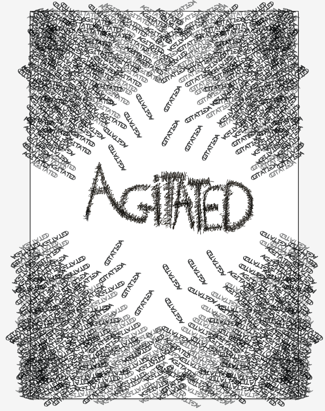
This hand-rendered design is clever in using typography to represent a separate idea.  A group of 'agitated' words communicates the emotion without using a set sentence structure or typographic form.  Along with type as image, this is another way to break away from the norms of typography as a means of expression.

---

Editorial 1


This campaign takes the structure of another form, in this case a building, and applies it to an editorial grid.  A very good way of linking editorial work to the original subject, and an experiment into grid structure and the layout of items on a page.

---


Although the content isn't there, it still demonstrates the relationship between editorial design and info-graphics.  The imagery and the body copy are printed in greyscale, allowing the graphics to stand out through the use of colour.

The diagram and the labels directly lead the reader to the descriptions as part of the editorial spread. The way the layout and the graphics complement each other and work as one is something I need to consider if I were to use info-graphics as a part of my Rugby League brief.

---


The brief here was to make a book that explored creative writing.  With thousands of books on the shelf at one time, it was important for them to make the design stand out - a vibrant yellow was a good choice for this.

I love the clean layout, the white space keeps the page fresh and encourages the viewer to read on.  The use of leading also helps to break down the text, and the clear chapters breaks up the stories nicely.  The size of the book is also appealing, it gives the impression of a quick read that isn't too overwhelming.

---


What I like about these spreads is the page format - it doesn't conform to the regular A3, A4, A5 etc. allowing for the grid to be changed and experimented with.  Four columns prevent the reader from losing their place in the text - any more than 12-15 words per line can make it difficult to break onto the next line.

The images that are given room to breathe tend to complement the editorial work more effectively.  The first example is surrounded by text; it seems to be confined into a space that is over-ruled by the body copy.  It also looks to be distributed unevenly amongst the text - it's placed too close to the right column.

---


Monday 15 October 2012

Iconography 1


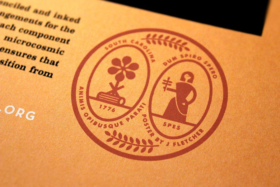
The iconography in this example is aesthetically pleasing, the stock that it is printed on really complements the orange, but the meaning is unclear to me.  It looks to have some correlation with farming, and perhaps if I lived in South Carolina then I would understand, but it isn't universal.  It goes to show that even though the designer knows what he's getting at, it doesn't necessarily mean that the consumer will.

This is something that I will have to be wary of, making icons universally accessible is a strong ethic of mine.  An inclusion of a key may also be a solution to this.  Nice icons, but unfortunately very unclear.

---


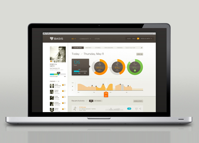
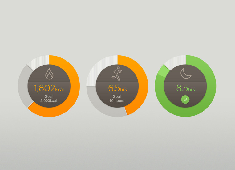
An example of combining iconography and info-graphics, in this instance to compare physical performance through exercise.  The data is recorded through a small wristwatch and presented through info-graphics on the company's website.  It includes pie, or ring, charts - which offer varied outcomes through percentages.  Another way of showing progress is through a running line graph, which monitor performance in a clear and concise way.

If I were to reflect the graphs onto film, I could do weekly sales through a line graph and popularity by country in a pie or ring chart form, for example. 

---


The separate pie charts are a good way to display information with multiple variables, for example when asking males what movie they preferred from 3 examples, maybe a female response would be necessary as well.  Instead of doing 2 pie charts for men and women separately, 3 pie charts for each movie - with both the male and female response on each chart - would give a better visual comparison to the former example.

---