This is an example of spot colour, used to keep the design clean, making it easy to break down and to complement the the simple vector illustrations. The red used can also be applied to text to highlight key points.
Another technique used in this piece is the cut out front of the publication. I think this is most probably laser-cut, as the design is most likely too complex to be die cut.
---
This editorial cover uses two spot colours - purple and gold, to fill the illustration. I think it is a smart choice as the purple displayed would not have come out as vibrant as in CMYK, and printed using the four colour methods would result in a dull front cover.
---
This editorial, by the look of it, is printed in standard CMYK. But looking at the red, it seems to stand out more than any other colour, and it's possible that a spot colour is used along with the four colour process to enhance this.
---
Monochrome is used in this layout design, a tint of blue that refers to the subject of the article. This printing method is useful for creating a specific mood with photographs (green for envy, red for danger etc.) as it uses different tints of the same colour to build up an image in the same way that different shades of black build up a greyscale image.
---
This editorial uses two spot colours, overprinted, in a monochrome fashion. It displays the effect of overprinting within photographs, monochrome in particular, to gain this strange outcome. In my opinion, it looks too busy and has no real structure, but the way it has been laid out gives an almost 3D effect by overlaying and interchanging colour - making the whole design jump off the page.
---
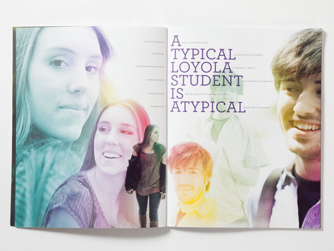
This spread uses a monochrome effect with the images of the students, using different colours for each. This would have to be printed CMYK as the range of colours would be too much to order different spot inks in for the job.
---


No comments:
Post a Comment