


These posters use devices to enhance the message typographically. Enlarging key elements of the quotes, twisting a message to give it the opposite meaning and blurring the message to communicate movement are all methods of enhancing the typography in a visual way - without using illustration.
The last example looks as though it could have a 3D effect with the right equipment. The statement is bold, and to stand off the page would give the design an extra level that would back up the original quote.
---

Another way to give typography an extra layer of meaning is by warping the text into a shape. Type as image would stay in my brief criteria by not using any illustration. A way I could respond to this is by warping a courageous statement into a shield, or a fearful quote into a ghost, for example.
---


Distorting the type is an interesting way to give a typographic poster added meaning, as it gives it a visual quality without resorting to illustration. All of these communicate distress in some way, in my opinion, and the last example in particular is completely readable, although the message looks to be swiped at and damaged.
---
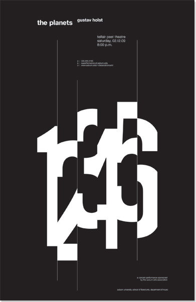
This poster, to me, conveys a sense of haste, cutting the numerals short before immediately moving onto the next one. The numbers are still understandable, but I'm unsure the same technique would work on letterforms - this example is in numerical order so any that are unclear would be identified by the sequence. But again, something that I can experiment with.
---

It's interesting to think about the line between illustration & typography. The droplets are attached to the letterform, but separately, surely it should count as a form of illustration. I think the distortion of a letterform falls under type as image, so it is still a form of typography.
---
No comments:
Post a Comment