
---


There are so many emotions linked with the tragedy that was 9/11, mainly Fear, Hysteria & Grief. A lot to deal with, but I think the designer has done a good job of portraying the right emotion at the right time, through typography, layout, info-graphics and photography.
"It was impossible to outrun" to me, is a statement of complete despair, complete hopelessness. The black text on a dark background comes across brilliantly, along with the placement of the text at the bottom of the page to imply broken spirit - feeling down and without hope.
The final statement, "America's biggest loss of life", is delivered well, on a plain background, clear and straight to the point. In my opinion, this communicates grief, as it overcomes the first obstacle - denial. The very matter-of-factly approach gives it a strong presence that can't be avoided. A good piece of typography.
The editorial style is almost de-constructive, promoting panic and hysteria, and the photographic style aids the overall theme of grief, despair & fear.
---

This illustration evokes depression, through the running watercolours. It's interesting how a simple technique like this can give the piece a completely different meaning. Smudging, distorting or "melting" typography could give the same effect, backed up by colour choice and composition.
---

An interesting use of image as typography, which helps to inform the user of the subject at hand. Without knowing the context, the reader knows it's a high number (20,000) and something to do with crime (handcuffs). This alone, provokes disappointment and shock - just by replacing the generic zero's with an image to represent them.
---
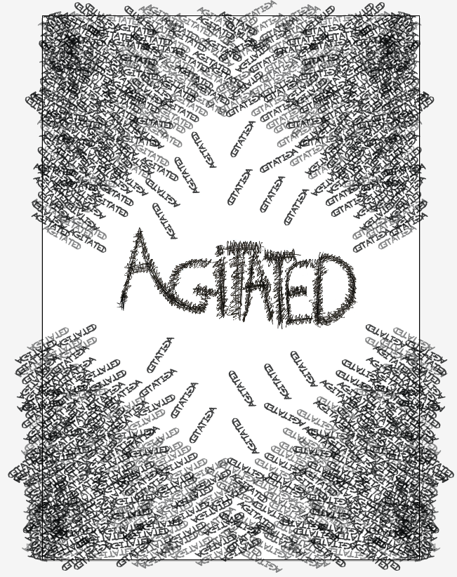
This hand-rendered design is clever in using typography to represent a separate idea. A group of 'agitated' words communicates the emotion without using a set sentence structure or typographic form. Along with type as image, this is another way to break away from the norms of typography as a means of expression.
---
No comments:
Post a Comment