This set of posters explore the same theme, but with different quotes and colours. The calligraphy, the typeface, the textures and the identity at the bottom remain consistent - allowing them to work as a set.
---
Both posters use photography to complement the typography. Granted, I will not be using illustrative type, but the way the imagery backs up the worded message is something that could have a greater impact when dealing with emotion.
---
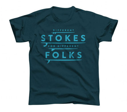
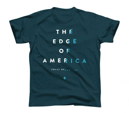
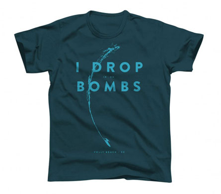
Typography doesn't have to be limited to poster design. T-shirt design is another good outlet for typographic arrangement. The 3 examples above are all on the same colour, use the same typefaces and grids to promote consistency. I think matching colours is unnecessary, it limits variation within the set and narrows down the target audience - other colours should be available to adhere to different fashion sense.
---


No comments:
Post a Comment