

The iconography in this example is aesthetically pleasing, the stock that it is printed on really complements the orange, but the meaning is unclear to me. It looks to have some correlation with farming, and perhaps if I lived in South Carolina then I would understand, but it isn't universal. It goes to show that even though the designer knows what he's getting at, it doesn't necessarily mean that the consumer will.
This is something that I will have to be wary of, making icons universally accessible is a strong ethic of mine. An inclusion of a key may also be a solution to this. Nice icons, but unfortunately very unclear.
---
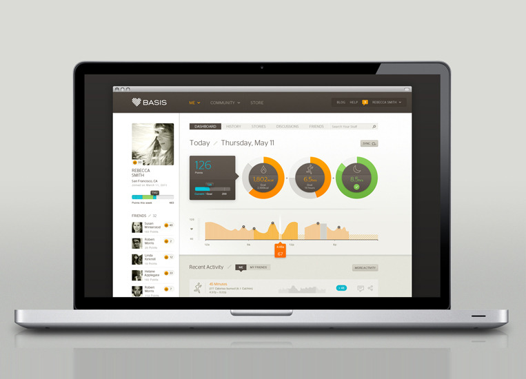
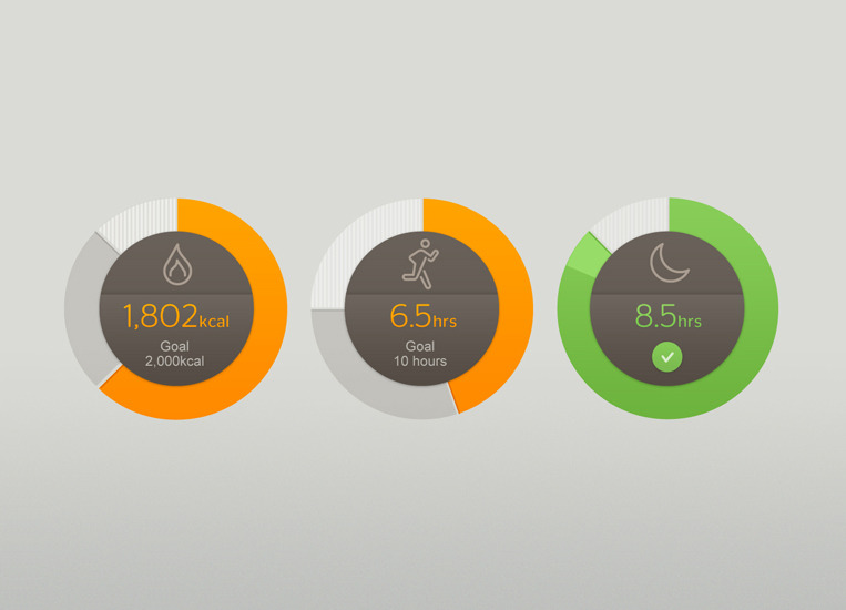

An example of combining iconography and info-graphics, in this instance to compare physical performance through exercise. The data is recorded through a small wristwatch and presented through info-graphics on the company's website. It includes pie, or ring, charts - which offer varied outcomes through percentages. Another way of showing progress is through a running line graph, which monitor performance in a clear and concise way.
If I were to reflect the graphs onto film, I could do weekly sales through a line graph and popularity by country in a pie or ring chart form, for example.
---

The separate pie charts are a good way to display information with multiple variables, for example when asking males what movie they preferred from 3 examples, maybe a female response would be necessary as well. Instead of doing 2 pie charts for men and women separately, 3 pie charts for each movie - with both the male and female response on each chart - would give a better visual comparison to the former example.
---
No comments:
Post a Comment