Showing posts with label Special Processes. Show all posts

Tuesday, 1 November 2011

Special Processes: Packaging & Promotion


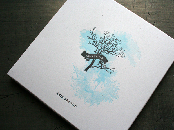
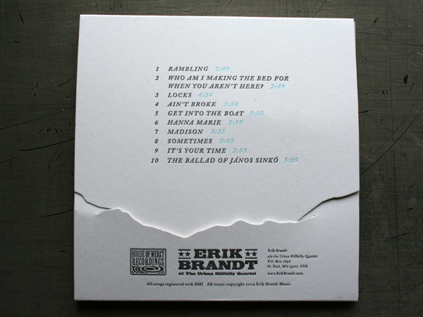
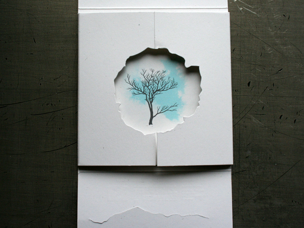
A beautiful piece of work, use of one spot colour, debossing and die cut to create a unique album cover.  It's work like this that I would buy regardless of the music; it's packaged in a way that stands out from the overworked album cover designs of the modern day.

The two special processes used are done so in moderation.  This prevents the design from becoming tacky and doesn't give the impression that it's done for the sake of it.

---

Special Processes: Branding & Identity


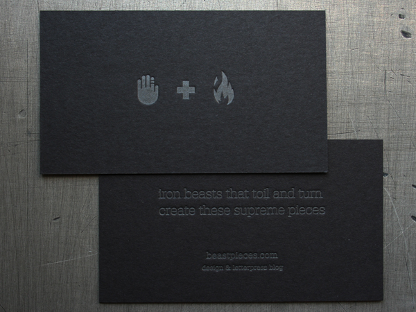
A simple business card on a good quality black stock.  It's difficult to get a feel for what process is used for this, but I think a silver or white foil would work really well to force the design to stand out from the stock and leave a lasting impression on the viewer.  Another method could be printing with white ink, which I don't think would work quite as well in terms of standing out from the black.  It would be a cheaper option though.

---


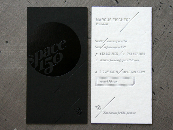
Another example of printing on black.  Looking at the shine of the work, it's most probably foil blocked to add class to the business card.  I like the simplicity of the design as it allows the foil to enhance the print without overwhelming the viewer with too much 'shine'.

---


I love this design; it is simple, clear and has depth with the debossing method.  The white space allows it to breathe, and the debossed holes on the stock demonstrates this further - it's as though air is literally flowing through the design.  This simple process keeps it fresh and easy on the eye.

---


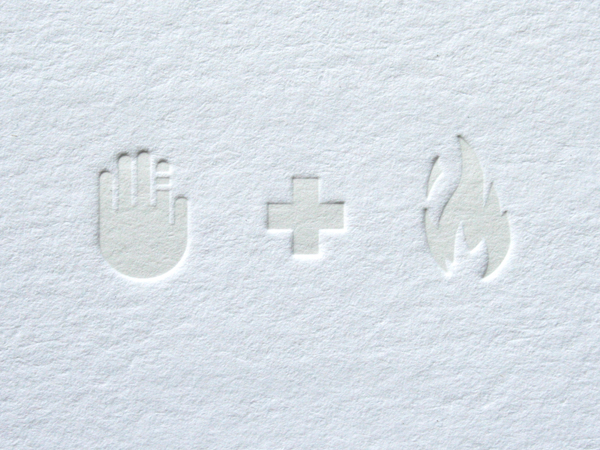
This is the pinnacle of simple and fresh design, in my opinion.  The fact that nothing is printed on these cards, that the designs are just debossed onto the stock is something that I really appreciate - it is a different way of putting design onto paper and adds a 3Dimensional aspect to the stock.  

Viewers can literally feel the whole design, and it would be an effective way to reach out to the blind.


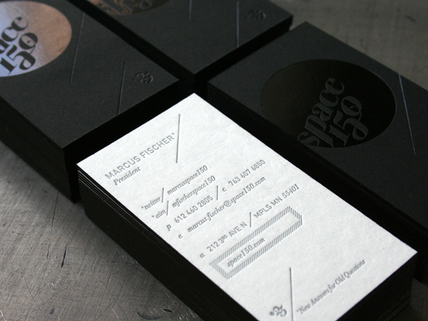
This business card combines two special processes - UV varnishing and debossing.  The varnish is there to add some worth to the card, to prevent it from being a throwaway item.  The debossing adds a 3Dimensional aspect to the design and encourages the viewer to feel it, to interact with it and to take the information in.

It's a clever way of branding a company or individual, as these processes immediately add a quality to their line of work or their product.  These simple printing devices give a professional and high quality first impression and would sell their service or product much more effectively than a standard, flat CMYK printed card.

---

Special Processes: Publishing & Editorial


This collection of design for the company 'Alma' could fall under various categories, but because it's focused around a guide of Barcelona, I will place it under 'Publishing & Editorial'.  The front cover and complementing designs are foil printed on high quality, thick stock.  This gives the whole package class and will reflect on the company itself.  

Using techniques such as foil printing can add to the cost of the job, but will also build a positive impression on the viewer that will stick with the company.  It will also encourage the customer to pick up the design and interact with it physically, because of it's shiny finish and textured surface where the foil has been debossed onto the stock.

Tuesday, 4 October 2011

Colour For Print: Publishing & Editorial


This is an example of spot colour, used to keep the design clean, making it easy to break down and to complement the the simple vector illustrations.  The red used can also be applied to text to highlight key points.

Another technique used in this piece is the cut out front of the publication.  I think this is most probably laser-cut, as the design is most likely too complex to be die cut.

---

This editorial cover uses two spot colours - purple and gold, to fill the illustration.  I think it is a smart choice as the purple displayed would not have come out as vibrant as in CMYK, and printed using the four colour methods would result in a dull front cover.

---


This editorial, by the look of it, is printed in standard CMYK.  But looking at the red, it seems to stand out more than any other colour, and it's possible that a spot colour is used along with the four colour process to enhance this.

---


Monochrome is used in this layout design, a tint of blue that refers to the subject of the article.  This printing method is useful for creating a specific mood with photographs (green for envy, red for danger etc.) as it uses different tints of the same colour to build up an image in the same way that different shades of black build up a greyscale image.

---


This editorial uses two spot colours, overprinted, in a monochrome fashion.  It displays the effect of overprinting within photographs, monochrome in particular, to gain this strange outcome.  In my opinion, it looks too busy and has no real structure, but the way it has been laid out gives an almost 3D effect by overlaying and interchanging colour - making the whole design jump off the page.

---


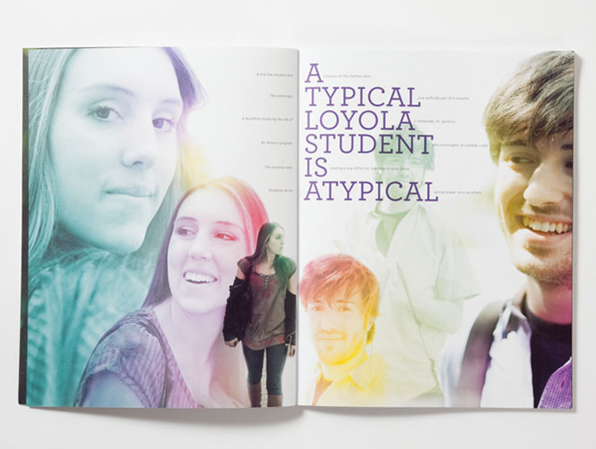
This spread uses a monochrome effect with the images of the students, using different colours for each.  This would have to be printed CMYK as the range of colours would be too much to order different spot inks in for the job.

---