Showing posts with label Task 2. Show all posts

Tuesday, 4 October 2011

Colour For Print: Publishing & Editorial


This is an example of spot colour, used to keep the design clean, making it easy to break down and to complement the the simple vector illustrations.  The red used can also be applied to text to highlight key points.

Another technique used in this piece is the cut out front of the publication.  I think this is most probably laser-cut, as the design is most likely too complex to be die cut.

---

This editorial cover uses two spot colours - purple and gold, to fill the illustration.  I think it is a smart choice as the purple displayed would not have come out as vibrant as in CMYK, and printed using the four colour methods would result in a dull front cover.

---


This editorial, by the look of it, is printed in standard CMYK.  But looking at the red, it seems to stand out more than any other colour, and it's possible that a spot colour is used along with the four colour process to enhance this.

---


Monochrome is used in this layout design, a tint of blue that refers to the subject of the article.  This printing method is useful for creating a specific mood with photographs (green for envy, red for danger etc.) as it uses different tints of the same colour to build up an image in the same way that different shades of black build up a greyscale image.

---


This editorial uses two spot colours, overprinted, in a monochrome fashion.  It displays the effect of overprinting within photographs, monochrome in particular, to gain this strange outcome.  In my opinion, it looks too busy and has no real structure, but the way it has been laid out gives an almost 3D effect by overlaying and interchanging colour - making the whole design jump off the page.

---
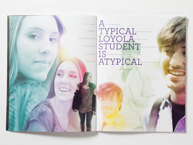


This spread uses a monochrome effect with the images of the students, using different colours for each.  This would have to be printed CMYK as the range of colours would be too much to order different spot inks in for the job.

---

Monday, 3 October 2011

Colour For Print: Information & Wayfinding


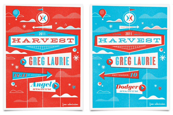
This set of posters uses two spot colours, inverted on each poster to separate them but to keep them consistent.  With the overprinted effect, it is most likely they are screenprinted to give the hand-rendered and one-of-a-kind quality to these illustrative posters.

---


These designs combine the name card and the guide to a conference in an extremely innovative fashion.  Each one has a sticker that categorises attendees and are printed with a spot colour for every category, demonstrated by the illuminant pink and yellow that isn't possible with CMYK.

For the booklets themselves, no colours stand out as being impossible using the four colour process, so it will be a CMYK job, printed digital due to the unique print for each person.

---


Colour For Print: Packaging & Promotion


These designs promote the Christmas season by using the standardised colours - red, green and white.  Two spot colours, differentiations of the same colour, are overprinted to redeem the hand-crafted quality of the illustrations.  Although this could be done digitally, the most probable and most effective method of print would be screenprinting - to bring out the imperfections and again to give the whole piece a hand rendered, unique quality.

---


This designers' self promotion uses a similar method to the one above, but takes advantage of the overprinting more effectively.  The "say I got" and the shading on the ribbon creates three colours out of two, in my opinion a creative way to add more depth to a flat, two-colour image.

---


I think this particular piece would be printed standard CMYK, as I believe all colours would be printable in this format.  However, the gold colour would have to be printed separately as a spot colour if made more vibrant.  If it was printed as a label for the bottle, I think the Rotogravure method would be appropriate as the durability of the copper plates would be suitable for the long print runs of a widely distributed whisky.

---


A vintage style of poster in the modern world, using techniques such as halftones and visual imperfections to gain that classic look.  I think this would probably be printed digitally, due to the fact that it's a poster and wouldn't be widely distributed like flyers or mailshots.  There's no evidence of any "ambitious" colours so standard CMYK would be used to print this in my opinion.

---


First of all, the gold in this print is completely unachievable in CMYK.  It would be most suitable for screenprinting but the limited evidence of overprinting makes me believe that the imperfections were done through software and printed digitally.  But, this is just my opinion.


---

Colour For Print: Branding & Identity


This logo uses two spot colours with an overprint effect.  Although it looks as though it would be suitable to be screen printed, I think the logo would be printed with whichever design of the company, whether that be litho, flexography or even pad printed for items such as bottles or spray cans etc.

'Base' is a simple logo that would be reproduced in any colour without a problem.  Because of this, it's difficult to say if it would be printed with a spot colour or CMYK.  It would depend on the design that the logo would be placed on, of course, but if they wanted to reproduce the red in this example a bright spot colour would be the way to go.

---


Although this is technically packaging of a product, the identity of the beer brand is important on this occasion.  The designs are consistent in style, and promote the whole identity of the company, rather than having separate designs with separate colours.

Although there isn't any colour on these examples, the nature of the illustrations would make it simple to replicate in other spot colours.  For this, I think it would simply use the black in CMYK with the pad printing method.  If the black needed to stand out, a rich black consisting of a mix of all four colours would make this more effective.

---